An Introduction to Data Driven Documents (D3)
This article is a continuation of my earlier post on how to migrate data from Twitter to MongoDB. I had been looking at ways of presenting the Twitter data from MongoDB in a graphical format. While searching, I came across the D3 (Data Driven Documents) JavaScript library.
D3 has been around since about 2011, but was completely new to me. I started by going through the excellent PluralSight course: D3.js Data Visualization Fundamentals, then had a go at creating my own simple chart, using my MongoDB data in the cloud. This post is just an overview, and there are loads of excellent tutorials available online, so I won’t go into too much detail on how to get up and running with D3.
D3 is definitely not a “here’s my x series data, here’s my y series data, plot a line chart” tool. It is quite low level, and requires a fairly good understanding of:
- DOM
- CSS
- JavaScript programming
- HTML
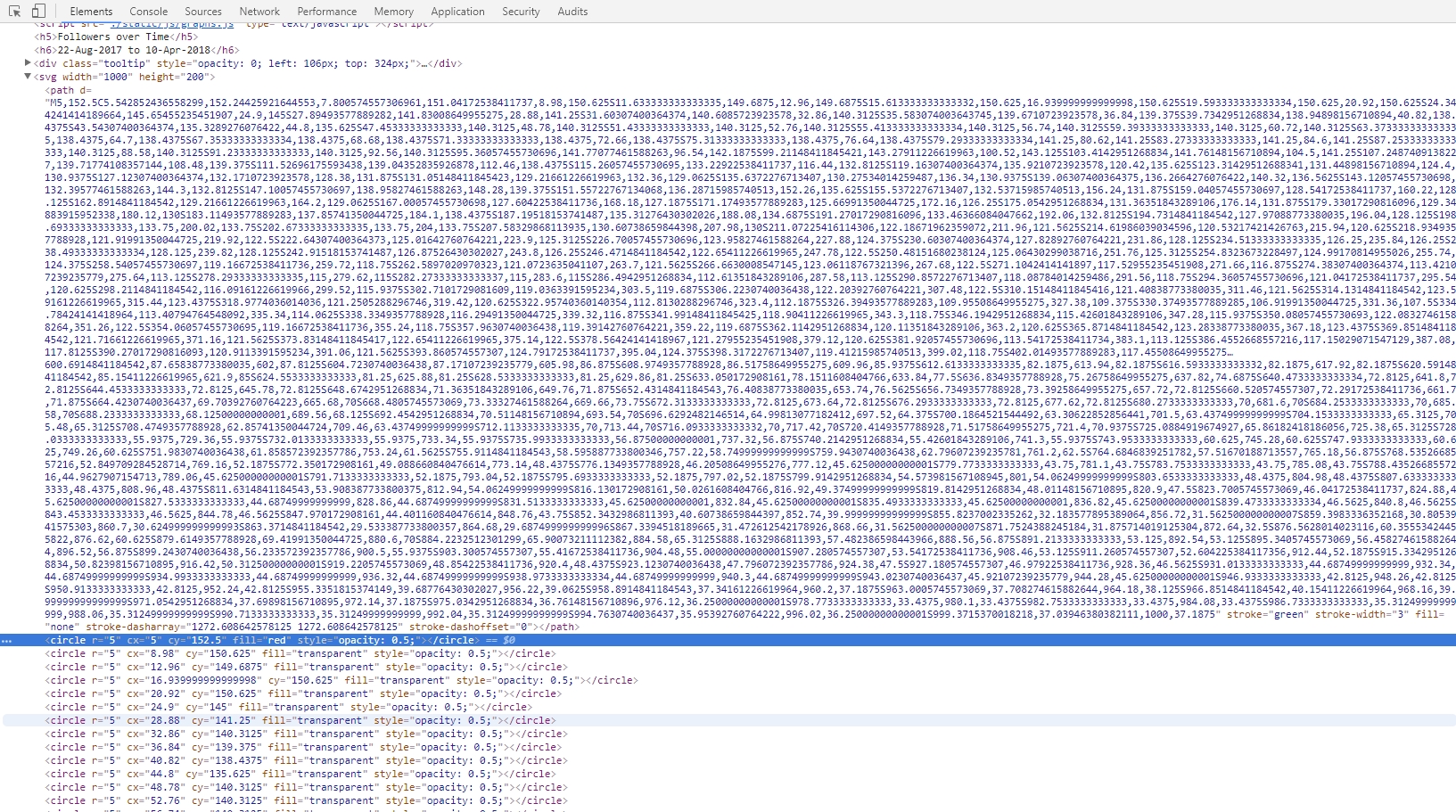
In return for the heavier investment in technical skills required to get up and running, you get incredibly fine-grained control over your visuals, as well as the ability to create animated and interactive content - which would be very hard or impossible to do with many other higher level graphing tools. D3 acts as a thin layer between your data and the DOM, and harnesses the power of SVG (Scalable Vector Graphics) to allow you to create visuals declaratively using XML style syntax. This screenshot shows you what D3 outputs to the page within the SVG tag:
I will run through the example I put together, after spending a couple of hours going through the PluralSight course.
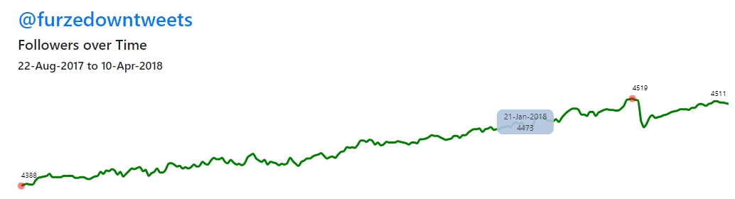
As part of my daily load from my @furzedowntweets Twitter stream to MongoDB, I have also been storing the total number of followers each day. I know this won’t provide any amazing insights, but I thought it would be a good data source to use for a simple graphing example - not requiring any data manipulation within MongoDB.
As I have been learning the Flask Python web development micro-framework recently, I thought I would continue with that platform for this exercise. So I set up a basic Flask app with two application routes:
- Index - returns the default page - this will contain all the graphing functionality
- RawData - this will connect to my MongoDB Atlas instance in the cloud, and return the followers by date data in json format
I created a graph.js file which contains all the d3 functionality.
The entry point uses one of the d3 built-in data import functions - in this case we are using json, but it provides methods for a wide range of different data files. The method below runs when the index.html page loads. It calls the /rawdata method, checks for any errors, then passes the json data to the main plotGraph method.
var data;
d3.json("/rawdata", function(error, json) {
    if (error) return console.warn(error);
    data = json;
    plotGraph(error, data);
  });
You can see the full graph.js module (including definition of plotGraph) here, but in summary, these are the steps I followed to generate an animated line chart showing total twitter followers over time:
- Initialisation - define height and width of SVG element plus other layout constants
- Data Parameters - get max and min of date range and follower count range
- Add text headings to page
- Define y scale
var yScale = d3.scale .linear() .domain([min,max + 10]) .range([h-padding, 10]) .nice(); - Define x scale
  var xScale = d3.scale
      .linear()
      .domain([0, followerData.length-1])
      .range([5, w]);
Note the domain and range settings above. This is a very neat feature of D3. To ensure that your graph fits within the area you have defined for it, you tell it the domain - ie the max and min of the actual data you are using - then tell it the range - ie the co-ordinates of the space that you want to fill on the page. D3 will then automatically scale your data to fit the space available.
- Define our graph line
var drawLine = d3.svg.line() .x(function(d,i){ return xScale(i);}) .y(function (d){ return yScale(d.count); }) .interpolate("monotone"); - Add SVG element to the page
var svg = d3.select("body") .append("svg") .attr({ width: w, height: h }); - Define path attributes - ie colour, width etc of the line, and define the transition which animates the line
- Define plot points - we are highlighting the max and min follower count points with a red circle, and also defining a mouseover event handler for all the plot points which will show the count and date for each point as an animated tooltip
- Define the plot point labels - we are only showing the counts for the max and min counts, as well as for the earliest and latest dates in the data range
And that’s it. It sounds like a lot, and the code looks quite long - but the d3 methods are all pretty intuitive. A lot of the coding is just dynamically rendering CSS elements or attributes based on values from our dataset. In theory, you could make this code a lot more elegant by moving re-usable parts to another javascript module, but otherwise, as my first attempt at a d3 graph, I think it shows the potential of what you can achieve using this library.
If you want to see the full potential of D3, go to Mike Bostock’s Blocks. Mike was one of the core developers of the D3 library. His website has thousands of examples which you can incorporate easily into your own code.
To deploy my Flask web app, I needed a Linux web server. I always like to take the opportunity to try something new on these projects, and didn’t want to just sign up to a new off-the-shelf Linux hosting account. This is going to be a tiny website, with very little traffic, so ideally I wanted a free or near to free as possible hosting solution. Of course, now is the time to try out Amazon Web Services. I already have an account but have never used it. To be honest, whenever I have looked into AWS I have found the sheer range of services available and huge wealth of documentation slightly overwhelming. However, with a bit of persistence and help from a couple of handy online tutorials, I managed to get a free Ubuntu web server up and running on Amazon EC2 in a couple of hours. I deployed my code to the AWS server using WinSCP over SFTP.
I used this excellent tutorial: Running a Flask app on AWS EC2.
And here is a link to the finished graph: FurzedownTweets Data - Twitter Followers over Time
The full source code for this example can be found here: https://github.com/JulianJoseph/d3-intro